Friday, September 25, 2015

Week 9: Experience Prototyping: The Restaurant experience

Restaurant Dining Experience 

In class we discussed experience prototypes. We were asked to consider how this form of prototyping could be incorporated into the process of designing new technology for restaurants. 3 different stakeholders were considered: the customer, the waiter, and the chef.
  • What is the existing experience? 
  • What external/internal factors impact on the experience?
  • What aspects of the existing experience could be enhanced/augmented/supported with technology?
  • How would introducing technology into this context change the experience?
  • What experience scenarios might you test with the technology?
Customer:
What is the existing experience?
The service they receive from entering until leaving the restaurant: Waiting for a table; being seated; reading the menu; ordering; waiting to receive their order; eating; paying the bill. Pre and post experiences could also be considered: booking a table; checking out a restaurant's website, review or social media; reviewing the restaurant after visiting.

What external/internal factors impact on the experience?
Recommendations and reviews, quality of service, quality of food/drink, price, speed of service, interior decoration, atmosphere, number of diners, queues, noise, customer's expectations, who they are dining with, other patrons.

What aspects of the existing experience could be enhanced/augmented/supported with technology?
The ordering experience, the menu itself is an obvious one. Another could be when waiting in a queue for a table at a busy restaurant, a system to see when a table is free, or get feedback on how long your waiting time will be, you could even start ordering before being seated to speed up service time.

How would introducing technology in to this context change the experience?
It might allow for less frustration when waiting for a table to open - customers could leave and do something else if they know how long to wait and comeback later. They also would be able to eat earlier if they ordered food earlier, and wouldn't have to wait as long while hungry.

What experience scenarios might you test with the technology?
Get a small group of "diners"in a waiting area to simulate the experience. Give them allocated slots which are display on screen, give them the option to wait, order and/or come back later at the estimated time. 
Sunday, September 20, 2015

IP1 - Testing and Evaluation

In this week's A Prac Class it was time to test my Interactive Prototype 1.

I firstly explained the goal of the game, to move the frog across the road while avoiding the moving trucks (red blocks). Most testers were already familiar with the Frogger game, so this was easily understood by the majority. After this, I explained how to control the frog character (using number keys and arrow keys).

As the game was quite quick to get through, I instructed testers to play as many times as they liked, until they won, or got sick of playing. The first few users all only got to move once, and died upon hitting the first truck. This was mostly because they didn't understand the number controls (each number could only be pressed one). After the first try they managed to progress further in the game.

The first 3 testers tried around 3-4 times, they all progressively improved however none made it to the end, so I adjusted the speed of the trucks to make the game easier. I also did a quick demo first, so show how the controls worked, rather than just give the instructions verbally. After doing this , all the testers managed to win at least once. It still seemed quite challenging (didn't win all the rounds) but could get through after 2 or 3 tries.

I measured by observation. I counted and noted the exact point where the tester's character died, so I had a quantitative measure of their progress over the span of their attempts. I also noted how they used the controls, and where their gaze was (either on screen or on the keyboard).

Many testers had some trouble using the number keys, especially in the beginning. However I am not so concern with this problem, as the next prototype's controls will be completely different. Plus the element of elimination of keys (or in he final prototype, character tiles) is an integral part of the gameplay, and is supposed to offer a challenging element - plus the game is quick, so it's fast and easy to restart the game if needed.

The testers didn't really notice the numbers on screen (showing which numbers were eliminated). Testers had their gaze on the frog character only, and occasionally looked at the keyboard. So I discerned from this, that visually showing what numbers/character tiles on screen probably wouldn't be necessary for the next round. The results from the survey as back up this - where 3 out of 8 finding the game a bit too difficult,  where most marked this as suitable.

As for the testing session itself, I probably didn't give enough explanation to the initial testers who had more difficulty grasping the controls, so giving a demo may have contributed to the improvement of the later testers.

For the next testing session, I'll still pay attention to the explanation of the controls and the difficulty levels, as these will be different again. The added concept the the guessing may also need to be paid attention to, as it adds another level of complexity to the Frogger elements and hasn't been able to be tested in this session.


Detail of results:

I had a total of 8 testers play my game and complete the survey.

Observation and process:

User 1: 

  • Died straightway on 1st truck
  • Died on 4th truck
  • Died on 7th (last truck)
  • Died on 7th (last truck)
  • User didn't understand that keys could only be pressed once at first. Kept pressing random keys in no particular order, so found it difficult to keep track of which keys were already pressed. Gave up after 4 times trying and not winning
User 2:
  • Died on 1st truck
  • Died on 3rd truck
  • Died on 6th
  • Died on 7th (last truck)
  • As the previous user, took a while to grasp the controls. Gave up after 4 times
At this point I made the game difficulty easier by reducing the speed of some of the trucks

User 3:
  • Died on 1st truck
  • Died on 6th
  • Died on 7th (last)
  • Died on 7th
At this point I made the game a bit more easier again. And I changed my method of explanation at the beginning, by demonstrating the game quickly first.


User 4:

  • Died on 7th (last)
  • Died on 5th
  • Win!
  • This user was the first one to make it across the road. The new difficulty level seemed to be improving the chance of winning
User 5:
  • Died on 7th (last)
  • Win!
User 6:
  • Win!
  • Died on 6th
  • Win!
User 7
  • Died on 7th (last)
  • Died on 5th
  • Win!
  • Died on 4th
  • Died on 4th
  • Win!
  • Win!
  • Win!
  • This user seemed to enjoy playing and kept playing the game after they already won.
User 8
  • Died on 7th (last)
  • Win


Survey:

Wednesday, September 16, 2015

Week 8: Non-traditional Physical Interactions

Some ideas (some good but mostly not so good) exploring some unique types of physical controls:

Email

  • An email is represented by an object such as a block. By putting the block in different containers will correspond with moving emails to different folders. Putting a block in the "trash" can will delete the email.
  • Each of your email contacts are represented by a character figurine. Speaking up close to a character will record and send an email to them.
  • Email inbox number is represented by a level (like a thermometer), the higher it is the more new emails you have. The goal is encourage the users to lower the level to zero.
  • Emails are printed on cards, when the card is crumpled the corresponding email is deleted.
  • Pick up a pencil to start a new email. Anything you say when the pencil is held will be converted to the email's text.


Twitter

  • Writing a tweet on a post it note (limited space means limited characters used) and pinning it to a board posts it.
  • Printing a tweet (may have special identifier such as QR code) and display it on a special board will add it as a favourite tweet and then display your favourite tweets physically, offline
  • Notifications received will be literally "tweeted" with sound. Tweet text is converted to audio and can be played back, like an answering machine.
  • A scrabble like board with 140 empty spaces. Placing letter tiles on these spaces will form a tweet. Once done lift the board vertically and throw off all the times at once to send tweet.
  • A small loudspeaker like device. When you want to speak, take out your loudspeaker and say your tweet into this. Everyone around you can hear it loudly, and it will also be captured and sent as a tweet.


Super Mario Bros

  • The player has to physically move, jump, run to control the characters corresponding actions
  • Related to the above idea, for multiplayer games, you have to verbally direct another player who cannot see their character on screen. They then must do the correct physical gesture. Afterwards they can see the game recording side by side with a recording of their movements.
  • Toys/figurines are used as controllers. So by moving the toy through a space or over physical objects represents the character in the game's action.
  • Collecting coins and other special items in the game also dispenses real world versions of these objects that you can collect as you play. You could even use these as currency, by inserting coins back into the game console to unlock levels, get more lives etc.
  • Punching a soft toy representing an enemy or an obstacle to destroy. The harder you punch, the more effective your attack in the game!

Friday, September 11, 2015

IP1 Game Concept

The concept for my game hasn't changed too much from my initial idea.

Concept Recap:
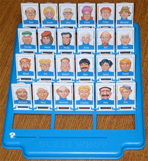
It's a game mashup of the classic games Frogger and Guess Who. While these games don't really have anything in common, I've taken some key components from each game to mix together into one awesome and challenging game called "Hop to Who?!"

Frogger elements:
  • The game objective of getting the frog safely across the road.
  • Timing the moves to avoid getting hit by moving traffic.
  • The frog character and the level design.


Guess Who elements:
  • Eliminating all the characters displayed so only 1 remains, by the help of descriptive clues.
  • Physical interaction of flipping down tiles.


The Story of 
"Hop to Who?!":

The Frog needs to cross the road to meet his blind date. As he crosses, the game will display clues about the characteristics of the blind date. The player needs to both get across the road and match the mystery date with the final remaining character tile.

How to play:
  • The on-screen interface will display a frogger like level, there also will be a physical Guess Who style board with 10-16 character tiles shown face up.
  • There are 2 objectives, both equally important. Get the frog across the road to safety and eliminate all but one of the characters correctly.
  • To move forward the player has to flip down a character's tile. Additional controls will be provided to move left and right.
  • The game will show clues about what the mystery character looks like, so the player can flip down non-matching tiles.
  • The challenge is to flip the tiles down in sync with moving the frog to avoid collisions. This requires 2 mental processes to happen at once, strategic elimination and quick response.
  • If the player gets the frog to safety, then there is the added reveal to check if they have selected the right character. Hopefully the Frog can live happily ever after!


For this prototype, I've focused mainly on the Frogger game elements - the interface, and the controls of the frog to cross. In place of the Guess Who tile board tiles, I'll be using the number keys on the keyboard and also the left and right arrow keys, for controlling the movement forward and sideways. The mystery character and clues element won't be added for this iteration.
The goals of this prototype will be to check if players understand the controls to move the frog forward, and understand that once a number key is pressed then it is disabled and cannot be used again to move the frog. I also want to check the difficulty of the game, whether the vehicles are too fast or too slow.


Wednesday, September 9, 2015

Week 7 contact: Reviewing the Video testing session

Revisit your user testing questions from the video prototype. Or consider the ones for your next testing round.
  • Which are quantitative and which are qualitative?
  • Do you fall into any of the traps outlined previously?
  • How would you rephrase the questions?
Overall I was pretty happy with the wording of my questions and the nature of the feedback I received. I would only change some minor details and wording of some ratings values, to make it more descriptive and relatable for the tester. 


What was your first impression of the video?
This was a qualitative question. I felt it was useful in getting feedback on overall feelings and initial reactions to the video prototype.

Did you understand the concept? 
This was a quantitative question, but testers we're given the chance to add comments related to this question.

Did you understand the rules?
This was a quantitative question, but testers we're given the chance to add comments related to this question.

What parts didn't you understand?
This was a qualitative question and gave testers enough option to share their concerns.

How interested are you in playing this game? (Scale 1-5, 1: not at all, 5: Let me try it now!)
This was a quantitative question. This question was a little vague, but I think the values on the scale help give an indication of what the top and bottom ratings represent.

How unique do you think the game's physical interactions are? (Scale 1-5, 1:not unique at all, 5: very unique)
This was a quantitative question. I feel this question is probably not specific enough to what "unique" actually meant. The values on the scale could be more descriptive.

Do you have any suggestions to improve the game?
This was a qualitative question.

How would you rate the video and audio production quality? (Scale 1-5, 1: poor, 5: excellent)
This was a quantitative question. The values on the scale could have been a bit more descriptive.

In the testing stage, were my instructions clear? (Scale 1-5, 1: I didn't understand at all, 5: I understood the instructions clearly)
This was a quantitative question.

Did you have enough time to ask questions or add comments after watching? 
This was a quantitative question.

Do you have any other comments?
This was a qualitative question.


For the next testing session:

I need to really consider what I want to test and what kind of feedback I need from the next session.
My initial thoughts are to focus more on the understanding of controls of the game - will users understand that they the keys can only be pressed once, and only control forward and sideways movement. Also I'd like to check the difficulty level of the game. I may make the trucks move slower across the road for the first half of users, then speed them up a bit for the second part. I don't want to make the game too easy, but also want players to be able to win.


Week 6/7: CRC Cards and the making of IP1

In this week 6's session we created Class Responsibility and Collaboration (CRC) cards which really helped me to consider and plan out how to structure and build the code for the game.

For IP1 I'll probably only be focused on 2 main elements of the game: The frog and the vehicles.

Frog Class:

Attributes:

  • X & Y Position
  • Starting position
  • Orientation
  • Speed
Behaviours:
  • Move forward, left & right
Collaborators:
  • Vehicles (check for collisions)
  • Safe zone (position when it's crossed the road)
Vehicle Class:
Attributes:
  • Type of vehicle, ie truck, car, etc.
  • X & Y position
  • Speed
  • Direction (left to right and vice versa)
  • Colour
Behaviours:
  • Moves in one continuous direction
Collaborators:
  • The frog (check for collision)

For future prototypes, I've also considered:
  • Character Class - each Guess Who character will need different attributes concerning their appearance, ie is it wearing a hat, what colour, glasses, facial hair etc. It will also need a status (ie is it the chosen one or not). The chosen characters attributes will also affect and inform the clues given on screen.
  • Clues/Cluebox - this will display clues about the chosen character that players will have to guess. It needs to know which is the chosen character in order to give the appropriate clues to the player


CRC cards

In week 7, I have started working with the Actionscript 3 code. The Pong tutorial was really helpful in my game's code. Setting the location of the frog and truck objects and the movement and speed has been based on Peter's tutorials. I also followed this Adobe Masterclass webinar on making a Frogger game for some guidance (https://edex.adobe.com/resource/2c28f6fe2a/), although he built this using the Action panel and the timeline. Nevertheless it was useful in helping to consider the separate classes and objects I needed and how to structure some of the functions.

I decided to use the 0-9 number keys as the controls, since I'm not adding the Guess Who tile board interactions at this stage. These will control the forward movement of the frog, but can only be used once (as the tile flips can only happen once in Guess who).

Also instead of using the arrow keys for orientating the frog left and right, I decided these will just move it in a right or left direction which is I think is a lot easier to understand, and since there will only be a limited number of movement keys.

Other things to consider will be how to make the number controls only able to be used once and communicating this to the player visually. I'll also need a way to restart the game if the frog dies or if the player wins.

Starting the code the Frog class